311 DATA
UX UI Design Project
The Brief
Redesign the 311 Data Tool to improve accessibility, streamline the user experience, and ensure compatibility across desktop and mobile platforms.
The Background
311 Data is a web-based tool created by Hack for LA in partnership with Empower LA. It helps Los Angeles residents and Neighborhood Councils visualize and explore non-emergency city service requests such as potholes, graffiti, tree removal, and trash collection.
Neighborhood Councils are community advisory groups that help connect residents to City Hall. The tool was designed to support them by providing better visibility into service request data within their areas.
The Problem
Despite its usefulness, the original tool had low user engagement and presented barriers to non-technical users. Many visitors dropped off before completing a search, the compare feature was underused, and the experience on mobile devices was poor.
The Solution
We reimagined the tool with a responsive design, clearer interface, and more intuitive user flows. The new design made it easier for users to start searching right away and offered both basic and advanced functionality in one unified experience.
Project Info
Team: Dana Chen (Lead UXD), Kevin Perez (UXD) , Selena Jiang (UXD), Yuenyi Lam (UXD), John Ritchey (Product Manager), Adam Kendis (Lead Developer)
My Role: I led the design effort across the project, from user research to final prototyping. I facilitated design studio sessions to encourage collaboration, ensuring every team member had a chance to sketch ideas before we came together to review and align on a shared direction. I also reviewed Hotjar recordings, ran usability tests, and contributed to both low- and high-fidelity mockups.
Tools: Figma, Mixpanel, Hotjar
Platform: Web (Desktop, Tablet, and Mobile)
UX Process - Double Diamond

We followed the Double Diamond approach. Once we aligned on the user and business goals, we moved through research, problem definition, ideation, and delivery. The process helped us stay focused while giving us space to explore different directions and test ideas quickly.
Step 1: Research
Site Analytics
Using Mixpanel, we saw that users were dropping off before completing queries. The compare feature had low engagement, and a significant portion of visitors were using mobile devices despite the site being built primarily for desktop.
Reviewing User Behavior
We used Hotjar to view session recordings and learned that:
Users didn’t understand when search results had loaded
Few users accessed the compare page
Mobile users abandoned the site quickly
Required inputs were often skipped, leading to failed searches
User Testing
We validated our findings through usability testing and discovered:
Users had trouble knowing whether their query was submitted
The experience was too complex for non-tech-savvy users
Many wanted a way to find their neighborhood council first
Define
After gathering insights from analytics, user recordings, and testing, we synthesized our findings to clearly define the problems we needed to solve. The evidence pointed to a few recurring challenges:
Non-technical users were confused by the interface and didn’t know how to complete searches
The compare feature was disconnected and rarely used
Users needed a way to look up their Neighborhood Council before exploring data
The tool did not work well on mobile
There was no feedback confirming whether a search was successful
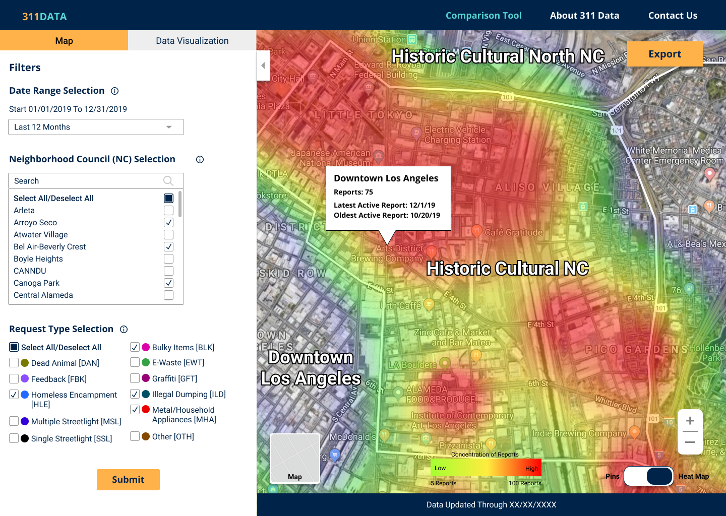
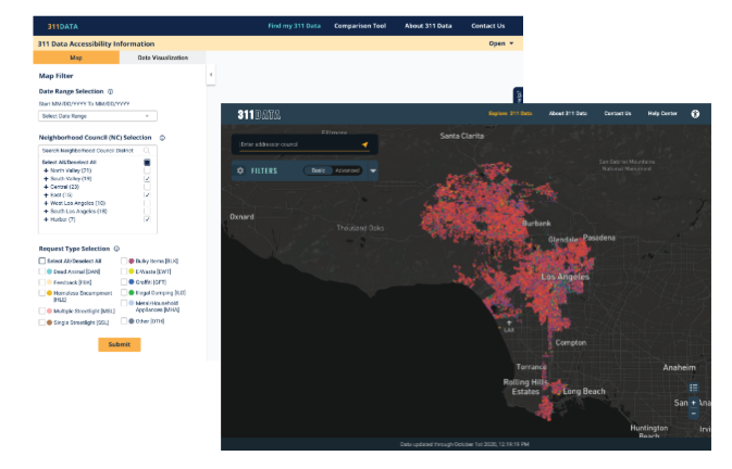
We also reviewed the current design, which helped us visually identify friction points. The original interface required users to select from multiple dropdowns, toggle neighborhood councils and request types, and then hit a "submit" button to view results. The satellite-style heat map looked visually intense and sometimes overwhelmed first-time users. There was no clear feedback mechanism to indicate whether a search had worked, and the mobile version was nearly unusable.
Having clarified our core challenges and defined our design goals, we revisited and refined our user personas to ensure they still aligned with our target users' needs. These personas helped us visualize how different types of users—both community members and Neighborhood Council leaders—would interact with the tool. To better map out their experience, we created a journey map that highlighted key pain points and moments of opportunity, which directly informed our design decisions moving forward.
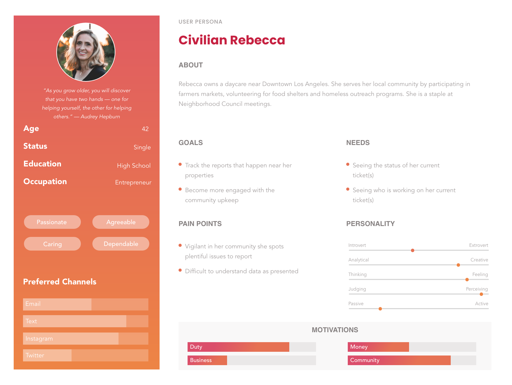
Personas
We developed two key personas to guide our design:
Civilian Rebecca and Counselor Dave.
Rebecca is a dedicated community member who wants to stay updated on issues near her property and be more involved in neighborhood upkeep. Her biggest pain points include confusing data displays and difficulty tracking report statuses.
Dave is a Neighborhood Council member who uses 311 data to lead local initiatives. He’s focused on making complex data accessible to the public, but often struggles with the lack of clear visualizations and difficulty interpreting raw reports.
These personas helped ensure we were designing for both ends of the spectrum—from concerned residents to civic leaders with decision-making responsibilities.

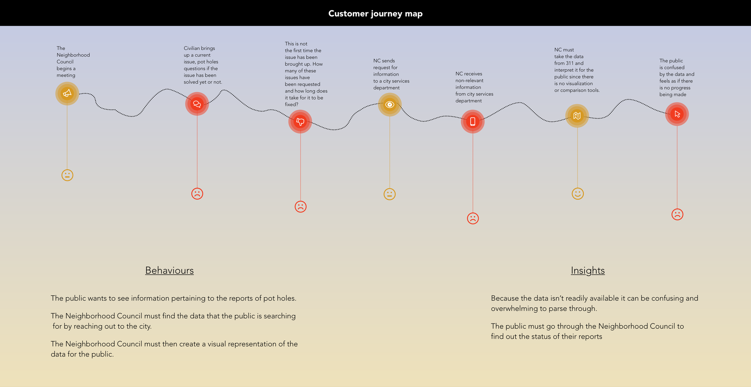
Customer Journey Flow
We mapped out a typical experience flow between Neighborhood Councils and the public. The journey revealed multiple pain points, such as:
Repetitive reporting of the same unresolved issues
Lack of transparency on the status of tickets
Confusion caused by data that is hard to interpret or visualize
Key insights:
The public feels disconnected from progress due to limited visibility and outdated systems. Councils spend time manually requesting updates and interpreting raw data for the public. These insights confirmed the need for a simplified interface, better feedback loops, and more intuitive visual tools.
Step 2: Design
Feature Prioritizations
Working closely with the product and developer teams, we identified several core solutions:
Combine the Data and Compare tools into one interface
Remove the need for a “submit” button with auto-loading results
Add an address lookup to help users find their council
Create a toggle for advanced features
Set defaults to help guide users without requiring multiple inputs
Provide map display options and visual flexibility
Design Studio | Sketching
We held multiple design studio sessions where team members sketched ideas individually before we reviewed them together. This helped us rapidly ideate and align on a direction that addressed both user and stakeholder needs.
Iterations
We made several rounds of updates based on usability feedback and internal reviews. Each version moved us closer to a tool that felt intuitive and efficient for both new and returning users.

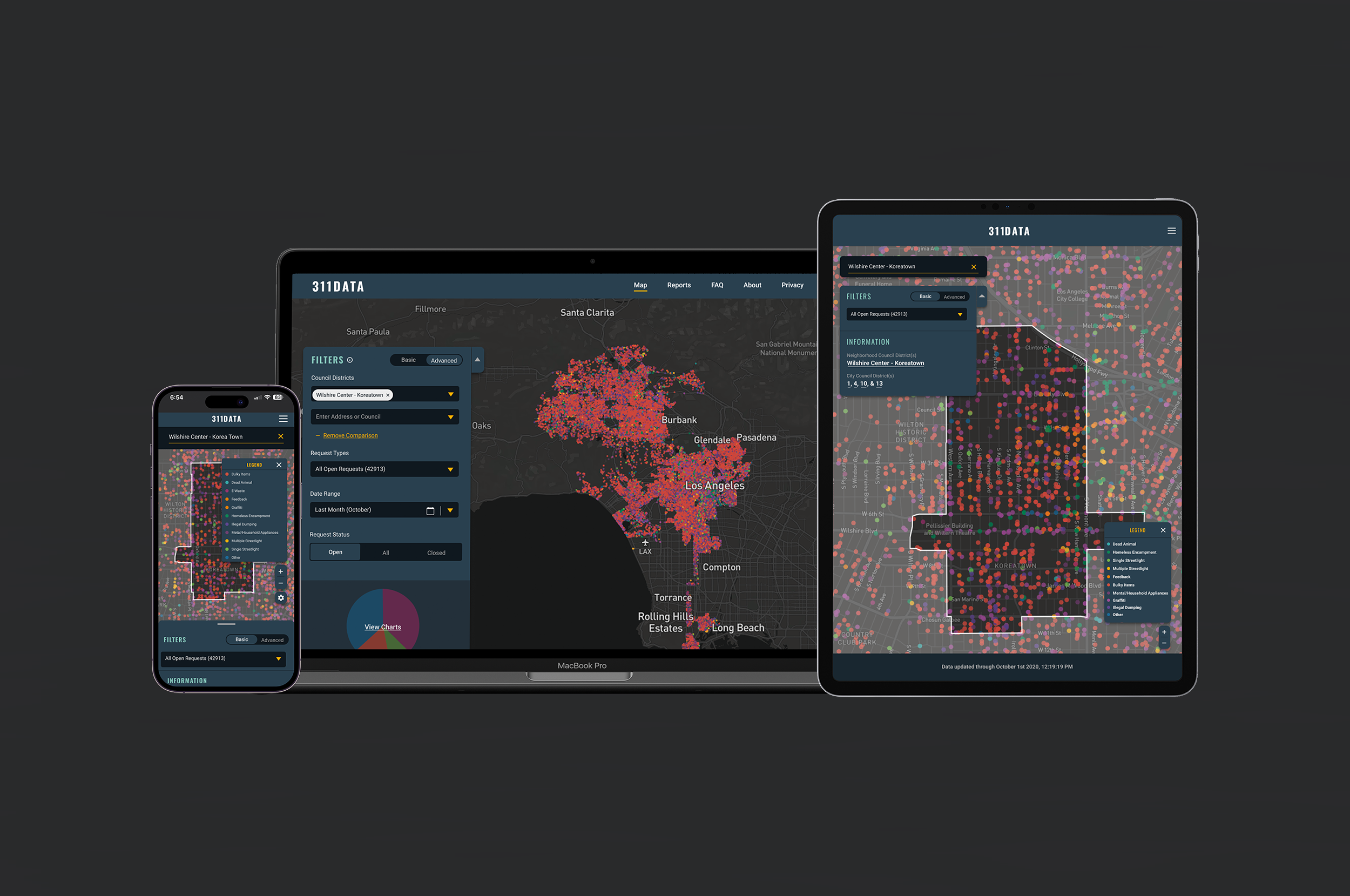
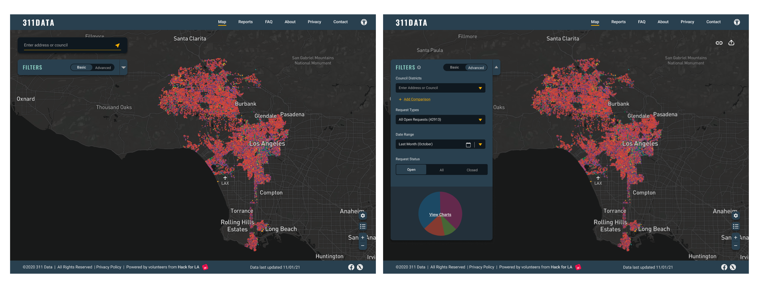
Final Design
Desktop View
The updated tool launches with visible data and a single input field. Users can type an address or select a district to begin. Filters are tucked into a collapsible side panel, and advanced features like charts and graphs are available as needed.
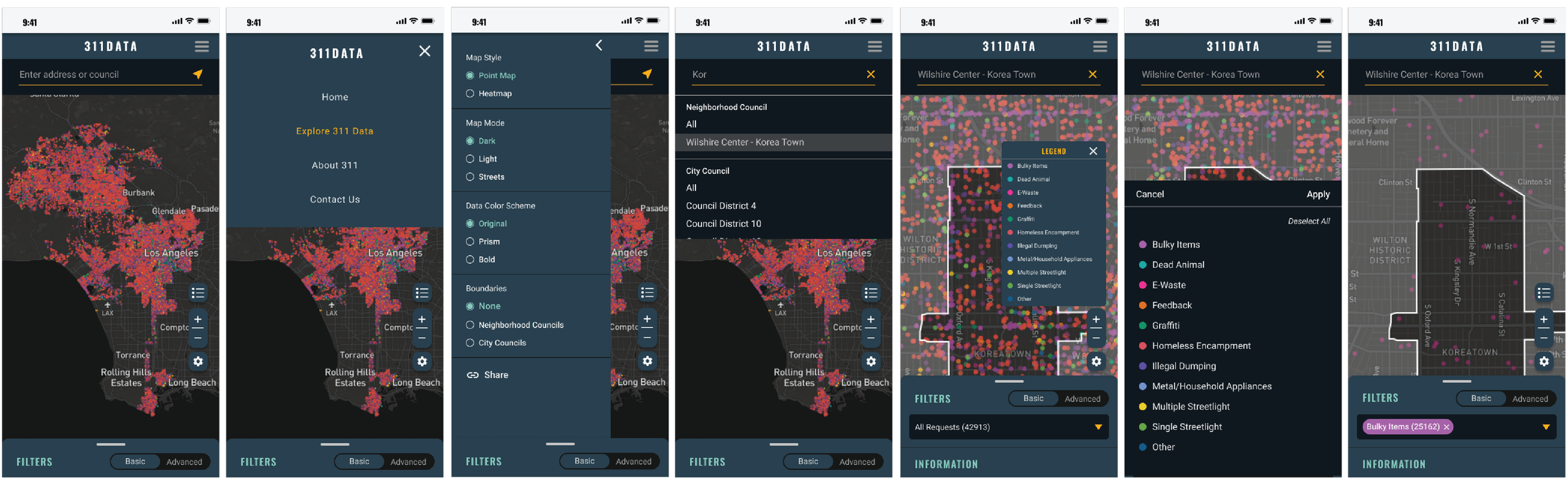
Mobile View
The mobile layout was designed with simplicity in mind. The search field appears at the top, and a sliding panel at the bottom holds filters and other tools. This lets users view the map clearly while still accessing features when needed.
Comparisons
We simplified the interface to reduce friction. The original tool required multiple inputs and a submit button. In the redesign, users can view data immediately, and features like the compare tool are integrated directly into the main flow. The look and feel were modernized while keeping the core utility intact.
Next Steps
Short Term
Add onboarding guidance for first-time users
Expand accessibility improvements
Continue refining mobile interaction patterns
Long Term
Enable users to save and share searches
Add reporting tools for Neighborhood Councils
Explore connections with other city datasets
Project Credits
Kevin Perez (UX Designer): Review Mixpanel Analytics, Hotjar Observations, User Testing, Brainstorming & Design Studio, Data Tool Mockups and Prototyping
Selena Jiang (UX Designer): Review Hotjar Observations, Data Tool Mockups and Prototyping
Yuenyi Lam (UX Designer): Review Hotjar Observations, Data Tool Mockups and Prototyping
John Ritchey (Product Manager): Brainstorming & Design Studio
Adam Kendis (Developer Lead): Brainstorming & Design Studio
Pras (Product Manager): Brainstorming & Design Studio